Tuesday 23 April 2019

Packaging Design


Packaging is a art of protecting the object . This  PACKAGING DESIGN made by me in Illustrator. It is a packaging of  capsule for GYM WORKOUT and  the size of packaging is accurate. There is
two parts divided in the LABEL  front and the back part. In the front part  I used to write name of the product , grading of product , benefits of product with quantity. In the back side it short description
about product and some precaution during taking the capsule with manufacture and expire date.. The color combination is blue with background in texture form as per client requirement. The logo of Magnus is also made by me. I used  the dumbel as its related to GYM . Some how i used the boxes just to highlight the main content  as well I had generate the bar-code which identify the product name with id. Packaging label created in 21-OCT-2018  and after so much correction regarding design the final design had selected and launched in 2-NOV-2018 with printed  shining lable in particular object.. Have a look after printing the LABEL on particular object just see below.....

Tuesday 16 April 2019

LOGO


 The word veggie fresh mean  the product which comes pure and fresh fruits and vegetables direct from farmers . I used to use two color one is dark green and another one is  light green the ultimate combination of  Natures .. The
green color mean renewal, nature, and energy with full of freshness.
There is slogan written in logo KISSAN KI SABJIYAN which mean the fruits and vegetables were providing to customer it is pure and fresh come direct from kissan .
I had created the logo by visualization the color combination and the shape of the logo which is coordinating with the product fruits and vegetables.
VEGGIE FRESH Logo  it was created on 22 September 2018, but finally it was launched in 22 November 2018 due to some corrections like spelling , color combination and most important
shape but finally I created the shape combination of fruits and vegetables ..

Monday 15 April 2019

Hoarding banner


This a hoarding banner in Potrate  form made in Illustrator(AI)  .The design I used to do it
which is related to product like vegetables and fruits. There  is two color which i used in this
banner coordinating with Logo color..and the logo is also made by me. I put the image near river
just to give a message of fresh fruits and vegetables as well this products It directly comes from farmer pure natural. I had divided and keep the products separately according to offers which was daily use product like Potato, Tomato,  Papaya etc.. , weekend specials like Apple, Mushroom etc.. and  combo specials fruits and vegetables. It was a letter size and Printable Banner.

Friday 12 April 2019

MENU CARD ( AI)


This is a menu card designed by me in AI( Illustrator) . There is a 3 to 4 color combination on it
with perfectly text alignment . Its a four fold menu card. According to restaurant item i had keep
some sample images beside the heading of ITEMS. I had kept the background with some of leaves and check box as its related to RESTAURANT  THEME.

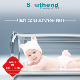
Banner Design


It is a Banner Design for clients with (SIMPLE & CREATIVE ) For social media post(SMO)..
which is  related to IVF (In Vitro Fertilization) it indicates that a women who not get pregnant
due to some internal issue problem with the help of  IVF Treatment it will convert the impossible
word to a possible word mean a women will get pregnant through IVF Treatment and feel like mother  while having their baby..
 As we can say being mother is one of the best feeling in the world and everything else just disappears.

logo


Firstly I made the logo without the name but its not look good so i decided to write the name within the circle which look good and feel like monogram . This logo is related to Education .
In b/w circle there is 3 icons one is child which is sky blue in color, second one is dark blue which anyone could be like parents or teacher and the last one is book as it is related to education i used to
put two color which was sky blue and dark blue..
Sky blue is like basic color for which we can say beginner  or start up period another one is
Dark blue is like experience which come from basic.

FLAWLESS INDIA  LOGO HAS BEEN LAUNCHED IN (20 FEB 2019..)

Tuesday 9 April 2019

BANNER


The Farganic means Pure Organic product for health ..It basically for health product so i used to design banner  which indicates the name Stress Less Tea from the word Stressless we come to know that  relax from daily activity like feeling of meditation. So its a combination of doing meditation and feel refreshment. I used to put the color green as its represent the organic GREEN TEA.

LOGO (PS)


This logo indicates the professional  design with carm , cool , simple with lots of creativity on it.
This logo is related to Fashion Designer Clothes for female. In this there is only one color which
was Golden which always shine and gives the sign of purity as well quality..  In between  of circle
there is a symbol of Diamonds which represents growing phase of human life style and value of product.... THIS LOGO HAVE BEEN LAUNCHED IN  5TH SEPT with Trade Mark.

Banner (PS)

Women has a different role in their life ... I used to design a banner related to women's day showing of the role of women... as they called a multitasking person who take responsibilities in home as well in professional life  very perfectly.....as compare to man.. SALUTE TO ALL WOMEN..

Most Important 10 points about chatGPT

ChatGPT is a large language model developed by OpenAI, capable of generating human-like responses to natural language queries. Here are 10 ...